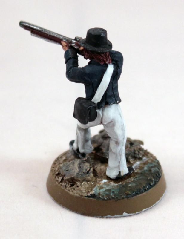
While my paints were out for the Marines, I also worked to resolve the now long-standing beach basing conundrum. My previous attempt (and 1st prototype) did not fully convey the mediterranean shore as well as I would have liked. Rather that jumping straight into a major overhaul, I tried to see if I could work with the existing basing and correct it toward my originally intended look. This was accomplished by tinting the water with a dark blue & green mix, blending it out lighter toward the shore, and then applying a thinned layer of my wet sand color (British Uniform) on top to mute it down a bit. it might be a little unrealistic to have such a deep color so close to shore, but I believe it balances the minature and gives some much-needed contrast on the base while also mirroring the deep blue of the sailor's short coat.
This is a lot of words to say that adding a little sea green really makes the scenic base read visually more as a beach. Further changes down the road would be darkening the seaweed and rocks to increase contrast to the sand, but I may save those for the next figures...(And of course there are some edges to clean up...)


No comments:
Post a Comment