
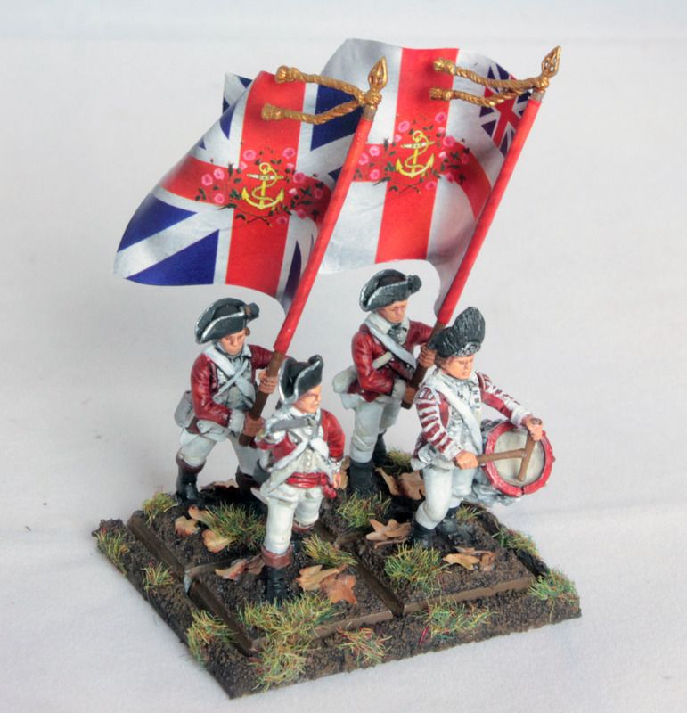
Previously, I showed my recent Marine Ensigns carrying their regimental standards. The process that went in to creating the flag designs deserved its own tutorial, as I think this can help other modelers & wargamers seeking to portray some of the more specific regiments in miniature.
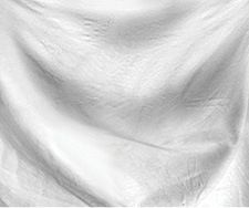
The colours began as a blank flag texture photo in photoshop, scaled to the correct size for printing. In this case, that is 1.5" x 1.25". I got the texture from axelfa. Note that it needs to be set to greyscale to properly blend in later steps.
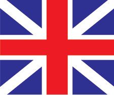
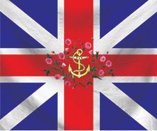
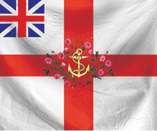
I created the Union Flag (and St. George's Cross for the unit Colours) in illustrator, and imported them as vector smart object layers in Photoshop, though this could be accomplished in any of the programs used. Regimental devices could be added at this step if recreated in vector, but I found that the softer blending techniques I used later obscured these graphics too much for my taste, so they would be added after the texture. N.B. it is helpful for the final product if you set your color modes to CMYK from the beginning, so you don't lose your colors when you go to print.
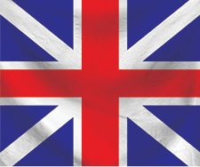
I then combined the vector graphics with the flag texture in Photoshop. The graphic layer's transparency is set to linear burn. At this point I have a nice union flag made, and it is ready for tailoring to specific regiments' colours.
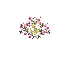
The Marines' colours were likely to have a fouled anchor device surrounded by rose and thistle ornamentation. This imagery I borrowed from photos of real-world items. The fouled anchor is from a Royal Navy uniform epaulet, while the floral work is from a flag used by an AWI reenactment group.
The anchor and floral ornament were also added as opaque raster elements on top of this to ensure crisp printing. I did leave a small black outline around the anchor because the definition of the gold elements were lost if they only had red to separate them. I was initially worried about it overpowering the design, since everything else is not outlined, but print tests showed that it works just fine. The flags were printed on a professional digital color press, on 24# uncoated text. The paper is about as thin as you can go while still retaining high print quality. After this, flags are cut out and glued with thinned white glue to their poles and shaped while wet.
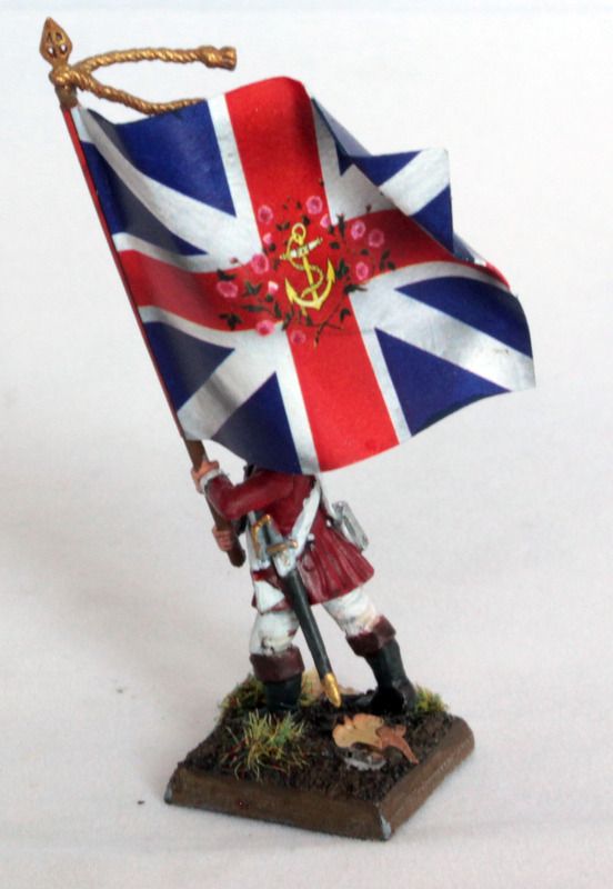
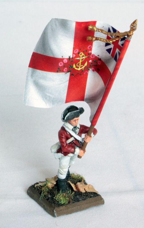
The final touch that adds some real life to the flags is painting the raw paper edges to match the design where it goes full bleed, as I find that willing suspension of disbelief is easier if the observer is given less to disbelieve. In the case of these two flags I only needed a deep blue and a crisp red to fix up the edges. This goes a long way in giving some lifelike detail to the figures and elevating the finished product into something a bit classier.
No comments:
Post a Comment